Friday, November 27, 2015

My Ultimate Artsy Goodness Wish List for Santa: The Pipe Dream Version


Black Friday is my annual "doomsday" when I pull all of my blinds, lock the doors, and scrutinize the caller ID if the phone rings. Since it is already after 10 AM here, I figure Walmart and Best Buy are already stripped like a Thanksgiving turkey at an office potluck, but I still won't set foot in town until Monday. I plan to do some gift list posts over the next few weeks, but all of the hyperbolic "Black Friday Blowout!!!" emails have inspired me to make my own wish lists as well. It is not entirely selfish since I am sure that other artsy folks are eyeballing the same products, and I know that choosing gifts for artists can be hard for non-artistic people.

Today's List is Pure Fantasy!


I used to hate asking for anything for Christmas, but as I have gotten older I understand that giving my loved ones a "wish list" is actually helpful and appreciated. It saves them time, and they won't be worried whether or not I will like their gifts. In short, wish lists are considerate, not selfish. Let me clarify that last point to say reasonable wish lists are considerate. I would never ask for luxury items that I secretly drool over, so I thought it would be fun to feature a list of awesome art-related gifts that I would really love but could never ask anyone to buy. I should also note that these items would never show up on this blog in review posts, so this is the only way I can justify the Black Friday window shopping drooling. Note: I round up the prices because who are we kidding with this $799.99 business?

Affiliate Disclaimer: For full transparency, you should know that many of my links in my posts are affiliate links. As an Amazon affiliate, I receive a small commission when readers purchase items using my affiliate links. This helps me fund the blog domain costs, and you will not be charged extra if you buy anything using my links. 

Wacom Cintiq ($800-$2800)

Even though I am an avid traditional artist, I still enjoy creating digital art. I have dabbled with graphic design and illustration in the past, so I have experience using graphic tablets and digital painting, drawing and photo editing software. I have owned a few Wacom tablets since 2004, and I tend to wear them out completely before replacing them. Currently, my daughter uses our most recent purchase- a Wacom Intuos Pen and Touch. However, Cintiq is the Holy Grail line for most digital artists.

Typical Wacom tablets act as input devices for your computer, so you are drawing on the tablet while monitoring your work on the computer screen. It takes some adjustment when you first start using one of these devices, but most people get the hang of it fairly quickly. Cintiq is very different because it is a monitor as well as a graphics tablet, so you draw directly on the screen like you would draw on paper. Wacom has now introduced the Cintiq Companion 2, which is a stand alone PC tablet with a Windows 8.1 (upgradable to Windows 10 for free) operating system as well as a high-end graphics tablet that you can plug into a desktop Mac or PC to use in the more familiar manner. Its 13.3 inch screen gives you plenty of room to express yourself as well. 

The specs are listed here, so I am not going to drone on about that. Prices for the Cintiq Companion 2 range from $1300 to $2300. The classic Cintiq monitors are still a thing as well, and the newest ones are divine! The 27" model (pictured below) will set you back about $2800, while the "entry level" 13" model is a modest $800.  All Cintiqs work with Windows and Mac, and you can probably get them to work with your Linux machine if you are gifted in that way. 

Image of 27 "Cintiq from Wacom.com
The 27" Cintiq is a thing of great beauty- click on image (credit: Wacom.com) to go to the webpage.


H Frame Studio Easels 

Since I only review products that I have actually used, I have not had the pleasure of making a post devoted to easels. I have been drooling over dozens of fantastic studio easels for months. I have a $17 folding aluminum easel that is good at one thing: pissing me off. By the time I get it set up in halfway usable configuration, I am too angry and frustrated to paint. I know that I will have to spend at least $100 if I want an acceptable easel, but the models that make my heart sing are way too pricey for my budget. Oh well, a girl can dream!

I want an H-frame because I can predict the space requirement more easily with the quad base. A-frames or tripod bases may need far more floor space than expected when used at certain angles, but the H-frame base takes up the same amount of floor space regardless of any adjustments. It is also more stable than the three-legged varieties. Jerry's Artarama has a pretty awesome selection of easels and some great Black Friday Deals that make me wish I had money. Here are a couple of my favorite H frames:


Image of Carolina Studio Easel from Jerry's Artarama

Carolina Studio Easel 

This is a classic H-frame made from "oiled and seasoned wood" that can accommodate a nice range of canvas sizes. It is fully adjustable so you can work standing or seated and its maximum height is over 100", so taller artists do not have to stoop. 
The usual Jerry's price is $160, but it is on sale for $119 currently.

Eagle Rock Studio Easel. Image from Jerry's ArtaramaEagle Rock Studio Easel

This is a variation on the same theme as the Carolina model, but the Eagle Rock H frame has a crank height adjustment, which means that you can change the height without getting up from your chair or removing your canvas.  The tilt angle, mast head, and canvas holder are all adjustable, and this easel has casters so you can move it around with ease. Two of the casters lock so you don't have to worry about it rolling away as you work. 
This lovely is available for just under $310 at Jerry's. 


Fancy Watercolor Paints

I use affordable brands of paints that are rather decent quality, but if I could buy any kind of watercolors, I would probably go for the pricier professional grade brands like Sennelier and Windsor & Newton. I also have a thing for pans, but why not go whole hog and get tubes for my fantasy art studio?

Sennelier French Artist's Watercolors are highly-rated professional grade paints that come in 10 and 21 ML tubes. There are 98 colors in Sennelier's collection, but my personal color pallet would include the following 21ml tubes:

Alzarin Crimson Lake,  $10.67
Cadmium red light,  $13.42
Bright Red,  $9.96
French Vermillion,  $9.96
Opera Rose,  $9.96
Rose Madder Lake,  $9.96
Burnt Sienna,  $8.80
Burnt Umber,  $8.80
Gold Ochre,  $8.80
Naples Yellow,  $8.80
Quinacridone Gold,  $10.67
Dioxanine Purple,  $10.67
Pthalo Blue,  $8.80
Cerulean Blue,  $13.42
Ultramarine Deep,  $9.96
Prussian Blue,   $8.80
Hooker's Green,  $8.80
Sennelier Green, $8.80
Sap Green,  $8.80 

Grand Total:   $187.85

I know I harp on limiting one's color pallet to a bare minimum and mixing colors, but this is a fantasy list for which I have hypothetical money to throw around, so the not-lazy color mixing is right out the window here. These are the big tubes, so I think I could survive several years with this much paint!


I have always loved Windsor & Newton products, but even student grade items from this company are a splurge in "real life". However,  I would not hesitate to consume these professional watercolors in a most conspicuous manner if I had the funds. These paints come in 5,14,and 37 ml tubes, but not all colors are available in all three sizes, so I listed the largest size for each color. Here is my fantasy W&N watercolor pallet:


Alzarin Crimson,  $14.80 (37 ml)
Cadmium red,  $14.65 (14 ml)
Quinacridone Red,  $11.25 (14 ml)
Windsor Red,  $14.80 (37 ml)
Opera Rose,  $10.40 (14 ml)
Rose Madder Genuine,  $23.40 (37 ml)
Burnt Sienna,  $14.80 (37 ml)
Burnt Umber,  $14.80 (37 ml)
Gold Ochre,   $10.40 (14 ml)
Naples Yellow,  $9.35 (14 ml)
Quinacridone Gold,  $14.80 (37 ml)
Permanent Mauve,  $11.25 (14 ml)
Windsor Blue (green), $14.80 (37 ml)
Manganese Blue Hue,  $10.40 (14 ml)
French Ultramarine,  $16.10 (37 ml)
Prussian Blue,  $9.35 (14 ml)
Hooker's Green,  $9.35 (14 ml)
Windsor Green (yellow),  $14.80 (37 ml)
Permanent Sap Green,  $14.80 (37 ml)

Grand Total:   $254.30

Yeah, I almost fainted when I saw that bottom line too! 

Well, it's great to fantasize about an unlimited budget or a generous benefactor, but in the real world I am not buying any of these items any time soon. Some readers may not find my list to be all that extravagant, but broke artists understand. If you have a little extra cash and want to give your beloved artist friend or family member something special this year, find out what  he or she secretly covets for their art studio. It may not be expensive at all, but even if you cannot afford that complete set of Rembrandt pastels, you can make it more affordable by giving the artist a gift card for his or her favorite art supply store.

My next posts are going to be gift guides for artists, and I plan to break them down by medium. I know that my family members are overwhelmed when they try to buy me arts and craft items. Shopping for artists is so much easier when you have a list tailored to their favorite mediums.

Thursday, November 26, 2015

The Artsy Goodness that Makes Me Thankful and Much Praise for Cheap Paintbrushes

Before I start getting everything ready for the face-stuffing extravaganza that is Thanksgiving, I want to take the time to give praise to my favorite art things. I know, the traditional formula is to honor my loving family and devoted friends first,  but those are sentiments I would rather express in person to the people I appreciate most, even though it usually makes them feel awkward and uncomfortable.

There are certain items in my disorganized arts and crafts hoard that never end up under my bed or stashed away in the back of the closet. Any artist would know their worth by their paint stained, duct taped and aged appearance.

Affiliate Disclaimer: For full transparency, you should know that many of my links in my posts are affiliate links. As an Amazon affiliate, I receive a small commission when readers purchase items using my affiliate links. This helps me fund the blog domain costs, and you will not be charged extra if you buy anything using my links. 

My Beloved Drawing Boards


image of a large, paint spattered drawing board


Thursday, November 12, 2015

ArtGraf Water Soluble Graphite: One Stick, Infinite Possibilities!


Affiliate Disclaimer: For full transparency, you should know that many of my links in my posts are affiliate links. As an Amazon affiliate, I receive a small commission when readers purchase items using my affiliate links. This helps me fund the blog domain costs, and you will not be charged extra if you buy anything using my links. 

Okay, so these sticks come in packs of two, and "infinite" may be an exaggeration, but in this case the truth would make a long, boring title. I have reviewed a few different water soluble graphite pencils in the past, and that experimentation has encouraged me to try other brands of this medium. I went for one of the most praised brands of water soluble graphite: ArtGraf. The sticks are the least expensive members of this line, so I decided to try them out for this review.

In my opinion, pencils limit the medium's potential because you can only do so much with that 2-3 mm core. A big chunk of graphite is as liberating as charcoal, and a big chunk of water soluble graphite is downright magical.  ArtGraph sticks do not have a specific degree on the label. They just say "soft", which is accurate since you can achieve very dark values with very little pressure. On the other hand, you can make light washes by grabbing the graphite from the stick with a wet brush. These are really light washes compared to the darker values you get from applying the graphite to the paper dry. Drawing on wet paper with a dry ArtGraf stick is interesting as well.


Sketch of woman's head using ArtGraf Water Soluble Graphite


Above:  I made the large sketch using the ArtGraf crayon and the smaller sketch using a Koh-I-Noor Aquarell graphite pencil. Pencils are better for the detailed bits, but the chunky graphite makes it easy to cover larger areas. If you look closely at the thumbnail sketch, you can see pencil marks where the lead made indents in the paper. This would come in handy for rendering textures, but most of us do not want these lines interfering with a solid wash or stroke of tone. The paper I used is Canson XL cold press watercolor paper.

Erasing


Well, erasing dry graphite is no big deal as it works the same way as a regular pencil mark. If you go back to erase marks that have been activated with water and allowed to dry, it gets a little trickier. Unless the marks are faints washes, you are probably not going to get the original paper shade back. You can still lighten areas, but if you want any areas of paper to remain pristine, it is best to use a frisket, masking fluid, stencil or tape to keep the graphite off that area.

While the limited erasing ability may be annoying, the upside is that after the piece is dry, you can touch it without smudging the graphite. During my experiments, I tested the darkest washes by rubbing the areas with my fingers. Yes, there was a little transfer, but it was so faint that I could not make a fingerprint on a clean piece of paper with the residue. Toothier watercolor papers will hold more graphite, so the smudge resistance will decrease with heavier applications of tone. You can counteract this by adding more water or working in layers, allowing each to layer to dry before applying the next.

Well, It took me long enough to finish this article! I started it over a month ago, but so many things came up, and I have to work a little harder now to get extra holiday money. I am still dedicated to this blog, however. I am working on some artsy gifts right now, and I will be posting some images and information about the mediums I use. Are you making any of your holiday gifts? If so, please share your ideas!

Friday, October 9, 2015

When Fails are not so "Fail-y" and, Finally, an Inktense Review


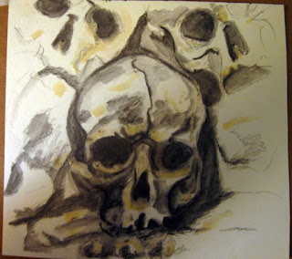
Skully Update, Derwent Inktense Review


Okay, so my last post was a step-by-step water soluble graphite and Derwent Inktense painting that I almost scrapped at the end. It was going just fine until I added color, but my choice of medium was not ideal. This is what I get for writing the post in real time while I am making the art. I did not want to scrap the post because I had already spent so much time on the whole affair.

I decided to let the painting dry completely before I would tackle it again the next day, so I put the piece on my table and went about my business. Then, my daughter comes to tell me something, stops mid-sentence, and stares at my little painting saying, "Ooooh that is so pretty!" My baby loves anything with skulls, bless her goth punky little heart. So my problem solved itself! Next thing I know, she is trotting back to her dungeon with the mini painting, happy as can be (she's not Emo), and so I don't have to work on the piece any more.

During subsequent experiments, I have discovered that regular watercolor and watercolor pencils work much better with water soluble graphite. Inktense pencils are not quite the same thing, you see. They have a water soluble ink base rather than the traditional watercolor pencil formula. The good thing about this is that once dry, the Inktense pigment is almost waterproof. You have the same translucent qualities but less chance of accidentally creating "mud".

Thursday, October 1, 2015

Spooky Artsy Goodness on a Zero Budget Plus a Step-by-Step Epic Fail

I think I get more excited about Halloween than I do Christmas, and I actually get excited about Christmas, unlike many of my jaded peers. Maybe that is why I have such an enduring love for A Nightmare Before Christmas- it's two great holidays in one Burtonesque package! Anyway, the new season and its string of gloomy storms has inspired my Gothic side (I was an original 80's Goth chic BTW), which is always just beneath the crazy cat lady surface.

I have already reviewed a few brands of water soluble graphite pencils in a previous post, so I will not rehash all of that, but I found myself returning to the medium recently to make some ACEO (Art Card Editions and Original) pieces that are inspired by my favorite iconic creepy characters.

My first series is very cliche, featuring Edgar Allan Poe and various elements from his Gothic literature. I also have plans for a Lovecraft themed series as well as some cards depicting The Addams Family, namely the classic TV series characters plus Christina Ricci's Wednesday Addams (I like hers far better, but the original was adorable too). There will be pumpkins, skulls, and black cats, too, of course. No points here for originality, but I think it will be fun anyway, and I can play around some more with my water soluble graphite.

image of Edgar Allan Poe Artist Trading Card
I made some ATC/ACEO sized boxes on crappy paper
(2.5" x 3.5") for practice. I always try to make Poe's head
less lopsided- must be a psychological thing or something.
 He had a weird shaped head. Sorry Edgar, but you did.  


How Being Broke Makes Me More Creative


I have run out of untouched watercolor papers, and most are painted front and back since I do not waste paper. What to do? Fortunately, I found my old Strathmore 400 series watercolor pad, which had once contained 12 poster-sized pieces of 140 lb cold press. There were no unused pieces left, but the two sheets still attached had plenty of blank areas, so I cut some irregular sheets out to make into art cards and miniatures. This was a very old pad that I had kept in the closet away from light and pets, so the paper is in excellent condition. This is what I do when I have no art money. I also rifle through my old drawings to see if any may be useful for collage or mixed media.


I kick myself now because it is obvious that I had used my nice paper to make random studies (not good ones either), and I see that I had either let my daughter draw on it or left it unattended so that she could doodle on it sneakily. She is an excellent artist now, but when she was younger she liked to doodle bomb my sketchbooks with little random gems, mostly boobs and nipples that looked like bulls-eyes. I never erase them, and I keep my sketchbooks, so I have blackmail material, buwahahaha.

On With the Spooky (and Cliche) Artsy Goodness! 


I decided to do a tutorial, or maybe more of a pictorial step-by-step, of my process using the water soluble graphite and other mediums to make some miniature art. I may even clear the virtual cobwebs from my semi-abandoned Etsy Shop to sell a few of my seasonal pieces. 

I have a folder of skull photos from the Internet, so for my reference I decided to use one depicting a well-lighted stack of skulls from the Kutna Hora ossuary in Prague. I used my phone to view the reference since it was closer to the size of my paper, a 5.5" x 6" square of the aforementioned Strathmore 140 lb cold press. The original photo belongs to Hendrik H, a member of the Viator site, copyrighted under a creative commons license. (So I will not sell this piece)


Step 1: Sketch


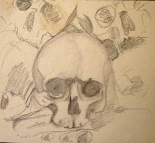
I sketched the skulls with a 2B Koh-I-Noor Gioconda Aquarelle graphite pencil. I have included three skulls, but I am concentrating on the central skull for this tutorial. Be advised that the lighting here is awful today, and it is only getting worse as my drawing progresses, so the photos are abysmal.


Sketch of Ossuary skulls next to photo on phone
The photo is hideous! My lighting is bad today, and
I suspect having a cell phone in the shot may affect color.


Step 2: First Wash


This is not a very dramatic transformation since I used the light 2B grade, but it establishes a little of the shadows. After letting it dry, I tried to erase a little bit of the graphite in one area, thinking it would go back to the white of the paper- wrong! That only works on smoother papers, I guess, so I do need to use masking fluid. Good thing I found out before adding the darker values!


Second step, sketchy layer with light wash
I have dampened the first sketchy layer. The yellow blotch is a
leftover bit of pastel from the awful study. I brushed it into the paper
with water after erasing it didn't work. 


Step: 3 (which should have been step 2): Mask off Highlight areas


This is especially important for small works because your highlights may be tiny. I have tiny detail brushes, but they don't hold enough water for this technique. They are for painting in details and highlights, not for painting washes around the tiny areas. I use the tip of my brush handle or a toothpick to apply the mask, and I use the Windsor and Newton colorless variety, which I bought ages ago. It lasts forever when kept in a tightly closed bottle, which is more than I can say for cheaper brands.

Also, be cautious about using masking fluid on papers lighter than 140 lb because they are not meant for this technique and may tear when you remove the film later.


image of Step 3 Add Dark values
I started working in darker values after the masking
fluid (yellow blobs) had dried.


Step 4: Darken Values


First, I make sure that my first layer of graphite wash and my frisket masked areas have dried completely. This is essential, and even though I am impatient when I am in my artsy mode, I have learned from past failures. The graphite washes dry very quickly, but masking fluid can take a little longer, especially in a humid environment. Of course it has been raining all week!

So I go over the darkest shadow areas with my 6B Gioconda Aquarelle, and then I activate the graphite with water using a Plaid #6 round brush. The process sounds like I am just slapping water over pencil strokes, but I am actually manipulating the washes as I would with watercolor paint to create subtle variance in the values.

You can see the yellowish blobs of masking fluid in the picture for this step, along with a lot of dark specks that look like crumbs. That is where the edge of my pencil rubbed against some masking fluid. All of this will disappear once I remove the masking film.


Image of drawing after steps 4 and 5
This photo encompasses steps 4 and 5


Step 5: Remove Masking Film, Refine Values


As you can see by the photo, my "unmasked" areas are rather rough and irregular, which is to be expected since I am working so small. That is no big deal- better to have too much highlight at this stage than not enough. I can use water and graphite to refine the highlighted areas. I added more 6B graphite to some shadows, and I used the HB Prismacolor water soluble graphite pencil for some mid-tones.  Yes, HB Prisma is darker than 2B Koh-I-Nor. I also realized that it is just the 2B KIN that does not erase well after it dries. I think it is the binder they use as there would be more binder in the 2B than the 6B.

You may be able to tell that I made a boo-boo on the left  eye socket. That was me trying to erase before the paper had dried completely. Learn from me- be patient.


Step 6: Add some InkTense-y Goodness


I want a wee bit of color in the final image. It may not be visible in my first picture, but there is a warm lighting in the photo as it appears on my phone, and I like this because it is more natural and moodier than a purely gray-scale image. I had promised an InkTense review, but this is not it.  I used the colors Tan, Oak, Sepia Ink, and Charcoal Gray to add touches of color throughout the composition. I have worked more on the background at this point as well, but I am not finished yet. There are several areas that require some refining and I need to add more details.

Yep, I screwed up adding InkTense tones. It is not so much
the color as how the ink interacts with the graphite. 

Honestly, I liked it better at step 5, but I may be able to save it yet. If nothing else, maybe you have learned a lesson from my failures here. As I said, I think I can make it look decent again. Most of my work has "awkward" phases, but sometimes I just don't know when to stop. What do you think? I will report back on this little piece when I write my next post. I may have to give up tonight and wait for better lighting tomorrow!


Friday, September 25, 2015

Books Full of Artsy Goodness: My Five Most "Dog-eared" Art Books

I was all set to do a review for the Derwent InkTense pencils, which are awesome by-the-way, but I had an artsy brain fartsy and just could not think of a subject to paint. It's the weather these days, not that I am sad to say goodbye to the 100 degree temps. Fall is my favorite time of year, and it should be inspiring my best work, yet allergies and migraines have been my daily bane for the past ten days.

When I get blocked, I usually pull out my favorite art books. Some of them are instructional, while others are just eye candy. I have many books in paper and digital forms, but there are certain titles that I always return to for an inspirational nudge when needed. I am not listing them in any particular order.

Affiliate Disclaimer: For full transparency, you should know that many of my links in my posts are affiliate links. As an Amazon affiliate, I receive a small commission when readers purchase items using my affiliate links. This helps me fund the blog domain costs, and you will not be charged extra if you buy anything using my links. 


pic from Amazon site Creating Textures in Pen and Ink with Watercolor
cover image from Amazon
1. Creating Textures in Pen & Ink with Watercolor, By Claudia Nice

My love of pen and ink predates my infatuation with colored pencils, which is saying a lot, believe me. I have Speedball dip pens, "Manga" style fine liner pens and countless other ink tools and products in my bottomless stash. I also keep a lot of pen and ink books, including several Kindle additions of works by Claudia Nice.


Tuesday, September 22, 2015

The Magic of Water Soluble Pencils: Reviews and Techniques for Royal & Langnickel and Derwent

I had half of this post written before I even started to play with the pencils I would be reviewing, but then I had to go and delete the whole bit I had written. Why? Because I had thought that my memory would suffice for certain parts of this review. I found out how wrong I was when I began to compare swatches. This is no way to review or discuss water soluble colored pencils. In fact, it is just boring and uninformative.

When looking at the dry swatches, there is very little difference, except for variations in a color between brands. That is because a swatch is a poor evaluation tool. I am sure that plenty of people want to know which brands are the best, but what if you buy the best and realize that the medium is nothing like you expected? When it comes to watercolor pencils, artists want to know how they compare to traditional watercolors.


Thursday, September 17, 2015

Crazy Pinterest Lady, Alien Abductions, and Random Colored Pencil Artsy Goodness

This week I have been quite busy with my "day job", which is writing articles for other people's blogs, so I feel bad for neglecting my own blog of artsy goodness. My work schedule is clear today, and I just tore myself away from Pinterest to start this post. For the record, Pinterest is my weakness, an ultimate time suctioning site that entices my visual thinker-and-learner brain with a smorgasbord of high-quality images that usually link to sources of even more images. Honestly, I lose more hours with Pinterest than a UFO abductee. Wait, maybe the E.Ts are in on it...

Anyway, yeah, Pinterest. My Pinner name is Cray Z. CatLady, by-the-way, and I have several boards that I maintain to satisfy my eclectic interests. I have a few boards related to art, of course, and I have found many fantastic websites and blogs during my Pinterest binges. One of them is the Sketchblog run by UK artist Lianne Williams, who shares my love of colored pencils, or "coloured pencils" as they spell it over there (I think the word is prettier with the "u" in it, personally).


image of Lianne Williams Sketchblog logo
Lianne's Logo from her Sketchblog
Image belongs to Lianne Williams


I really want to share this post from her blog because it reinforces my belief that expensive art materials are not necessary to make great art. In her post, Lianne creates a beautiful colored pencil portrait using Crayola colored pencils. Originally, I followed a Pin to one of her May articles, "My Essential Colour Pencil Techniques". She seems to be a great fan of the Polychromos!


Affiliate Disclaimer: For full transparency, you should know that many of my links in my posts are affiliate links. As an Amazon affiliate, I receive a small commission when readers purchase items using my affiliate links. This helps me fund the blog domain costs, and you will not be charged extra if you buy anything using my links. 

While I have a special love for certain artist grade varieties, I am all for using whatever you can afford or find. My eclectic stash of CPs does, indeed, include some random Prang and Crayolas, and I have the big deluxe box of Crayola crayons in my chest of drawing goodies. I use my Koh-I-Noor Progresso Woodless Colored Pencils often as well. They are not as cheap or easy to find as Crayola, but they are extremely affordable and durable.

Also, if you have a serious interest in colored pencil art, I would suggest checking out the Colored Pencil Magazine website and the "CPM Contests and Giveaways" blog. Currently, CPM is sponsoring a giveaway for a set of 12 Faber-Castell Polychromos. They have these contests regularly, so it doesn't hurt to subscribe. The prizes are always fantastic, at least in the eyes of colored pencil artists. The magazine is very nice, too. I am considering renewing my subscription after I pay off some bills. I have entered their monthly challenges in the past, but I have never won. That's okay because entering these competitions motivated me to create finished pieces and push my own skills with challenging subjects, like shiny candy wrappers:


Colored pencil art candies and shiny dishes
My September 2013 entry for the CPM monthly challenge


Personally, I love colored pencil, and I think the medium has begun to gather serious interest in the art world, thanks to many great artists who have created brilliant art works and published books about their techniques. I have several in my library. Do you have any favorite colored pencil books that you would recommend to fellow artists?

I hope that one day my own skills will evolve to the point where people will want to learn my techniques as well.


Sunday, September 13, 2015

Affordable Artists Pastels Part II: The Softies

Today, in Part II of my two-part pastel review series, I will discuss Rembrandt Soft Pastels and Mungyo Standard, Gallery, and Handmade Soft Pastels.

image of a box of Rembrandt pastels
My well loved set of Rembrandt 15 half-sticks.
The original white is gone, so I keep another brand of
white in the box .

Thursday, September 10, 2015

Affordable Artist's Pastels Part I: Prismacolor and Mungyo Semi-hard Pastels


image of assorted pastels in boxes
Part of my pastel stash, complete with dusty covers
(that is pastel dust, not home dust, btw)


I was going to break the pastel articles up by brand; however, as I started planning this first post, I realized that it would be better to separate them by hardness since I would be comparing brands in my reviews.  "Apples to apples", as they say. During my research over the past few years, I have learned that it is more beneficial to use different types of pastel when creating a painting with many layers of pigment. I am talking about full-on finished works that look painterly, not quick sketches.

Wednesday, September 9, 2015

Let's Talk About Pastel and Chalk Pencils: Conte, Stabilo, General's, and Koh-I-Noor

Even though my current obsession is charcoal, I haven't abandoned my other beloved mediums, of which there are many. Today I will focus on some brands of pastel pencils that I have tried. I'll discuss them in two categories: "chalk" pencils and true pastel pencils. I use General's and Koh-I-Noor chalk pencils and Conte of Paris and Stabilo Carbothello pastel pencils.

Affiliate Disclaimer: For full transparency, you should know that many of my links in my posts are affiliate links. As an Amazon affiliate, I receive a small commission when readers purchase items using my affiliate links. This helps me fund the blog domain costs, and you will not be charged extra if you buy anything using my links. 

All of these pencils have their own merits, and I am glad that I have the selection on hand because I have better results sometimes when I use them together and with standard pastels and charcoals. I have been using my Desert Song Multi-Functional pencil sharpener for all of my pastel pencils lately, and I recommend it highly. I have another review post for this sharpener that covers all the details, so I will not talk any more about it here.

General's Pastel Chalk Pencils


I am not sure how they did it, but the General Pencil Company managed to produce a pencil with a soft pastel core that does not crumble or break constantly. They are labelled "pastel chalk" pencils, but they are more like pastel than chalk- perhaps the name merely differentiates them from oil pastels. I bought the set of eight neutral colors, which includes black, white, light and dark grays, beige, burnt sienna, peach, and dark brown. They are great colors for portraits and wildlife drawings. There are larger sets available with additional colors as well.

First, I have to mention the erasers on the end of each pencil. They may erase the pastel at first, but I have found them more useful for blending. They get dirty fast, and the rubber is too hard to erase cleanly. I use my kneaded eraser when I have to remove marks, but the pastel in these pencils is very easy to erase with any soft eraser. 

The pastel marks are subtle, requiring a bit of layering, and they leave a lot of dust behind. I could not make a complete artwork with these pencils alone because they are not meant for extensive layering, so I use them to create an under-drawing or to blend color in small areas. Their softness should make them great for highlights, but the pigment is too weak for this, usually. However, General's white charcoal pencils are fantastic for adding small highlights as they have opaque white cores. I have only tried the neutral set of colors along with General's white and black charcoal, so I cannot comment on other colors, but sets of twelve and 24 are available, and all of these sets are very affordable. 

Koh-I-Noor Chalk Pencils  


KIN pencils are the polar opposite from General's in terms of pigment and texture. The cores are quite hard and sharpen to needle points, although a needle point is not very practical. Despite their hardness, the KIN chalk pencils have excellent pigment load, and I love the silky feel of the chalks when I draw on paper with them. They remind me of Conte crayon more than chalk, and they are even harder than my semi-hard pastel sticks. 

I only have dark and light sepia and white pencils from this line because they came in a mixed media drawing set. I have a sanguine pencil, labelled "red chalk" from this set as well, but the core is like waxy crayon and not at all like chalk. The matching crayon stick was the same way. They are nice, but they do not mix well with the other chalks from the set. 

I checked out the chalks on the Koh-I-Noor site and found that the company has both dry and oil chalks in pencil, stick, and 5.6 mm lead forms. KIN is a pricier brand than General's, and the choice of colors in this line is limited to traditional drawing shades: white, black, sepia and sanguine. They have sets of hard pastels that offer a large color range, but I have not tried them, and they are hard to find. 

The texture and pigment in the KIN pencils makes them perfect for initial stages of pastel paintings (working from hardest to softest), but I enjoy sketching and drawing with these pencils all by themselves. Their ability to hold a point is very useful for rendering small details. The white is too hard to use as a top highlight, but it is great for blending other colors and for drawing on toned paper. I love to mix the sepia and white pencils with charcoal in my drawings.

image of shaggy dog drawn with Koh-I-Noor Chalk Pencils, Nitram Charcoal, and Prismacolor white pastel
I used the Koh-I-Noor chalk pencils and sticks, soft
Nitram charcoal, white Prismacolor Nupastel to
make this sketch of a Pulli dog


Tuesday, September 8, 2015

Classic Artsy Goodness with a Little Ranty-ness on the Side

Last night I enjoyed the waning Labor Day weekend by watching some Hulu while sketching the evening away using my new charcoal sticks and pencils, which I have already reviewed in earlier posts. My mom popped in to tell me something, but she was distracted momentarily when she saw my sketch in progress, a portrait of a giant schnauzer. She remarked that the hair on his snout looked so real it was "almost touchable".


image of schnauzer charcoal sketch
My schnauzer head, charcoal and white pastel
I used a fellow Blogger member's photo from
Magna Giant Schnauzers.
My sketch needs more work, but I have
come to love charcoal more with each piece!
I was flattered, of course, because I strive to convey  a certain amount of realism in my work, but I do not aspire to photo-realism. While I admire the skill and dedication of photo-realistic artists, I am rarely moved when I look at these pieces. I like to see the artist's "hand" in the work and get a feel for his or her style. I am much more inspired by stylized works than by seemingly mechanical copies rendered in precise detail and scale. So I give props to the uber-realists, especially those who have spent years honing their drawing skills. As you can see on the left, I cannot compete in the photo-realism category, but that is no big deal for me. I want people to know that I have drawn or painted my image.  

Friday, September 4, 2015

More Charcoal Artsy Goodness: Marie's Paper Wrapped Charcoal Pencils, Nitram Review Update

Affiliate Disclaimer: For full transparency, you should know that many of my links in my posts are affiliate links. As an Amazon affiliate, I receive a small commission when readers purchase items using my affiliate links. This helps me fund the blog domain costs, and you will not be charged extra if you buy anything using my links. 

Yesterday, our wonderful UPS delivery man, Jamie, brought me some goodies that I had ordered from Jerry's Artarama. Whenever I get a box from Jerry's or Amazon I am like a kid at Christmas even though (or maybe because) I already know what is inside. This time the contents included a box of twelve Marie's paper wrapped charcoal pencils, a packet of two Tombow Mono Zero eraser stick refills (I'm not reviewing these), and a pack of five Nitram Academie Fusains in the soft B grade. I have already reviewed Nitram Batons Moyens and the Tombow Mono Zero in previous posts, so today I will start with Marie's charcoal pencils.

Thursday, September 3, 2015

Artsy Goodness "Odds n' Ends": Erasers You "Knead" and Whatnot

Sorry about the corny title, but I am an unabashed art nerd. This will be a hodgepodge post with a side of lagniappe in the "artsy goodness" category, but I promise to make it interesting and useful, just the same.

As a little teaser, I will list some of the items I plan to review  and/or discuss in upcoming posts:

Upcoming Product Reviews

  • Derwent water soluble pencils: InkTense, regular  watercolor pencils, and, hopefully, water soluble sketching graphite and graphitone pencils
  • Daler Rowney pan watercolors: Aquafine and Simply
  • Nitram Academie Fusains, Maries paper-wrapped charcoal  
  • Various Pastels: Rembrandt, Mungio Gallery, Prismacolor NuPastel, 
  • Pastel Pencils: General's, Conte, Stabillo Carbothello, Koh-I-Noor 
  • Acrylic painting Mediums: Liquitex slow-dry retarder, Flow-aid, Air brush medium, and fabric medium, Daler Rowney glazing mediums
  • Artist markers: Copic, Prismacolor, Sharpie (yeah, why not?), Tombow

Possible Future Topics

  • Halloweeny stuff- great crafting possibilities  
  • Affordable digital painting software
  • Scoring artsy freebies 101 
  • Artist Paper: when to scrimp and when to splurge (with semi-reviews)
  • Favorite mixed media combinations
Please note that these are not listed in the order I will publish them. A few items I plan to review are still in the "wishlist" category for now, but I own and use most of these products already. 


Today's reviews will include the Tombow Mono 2.3 mm round shaper, the Pentel Clic, and various rubber and putty varieties.

Saturday, August 29, 2015

Nitram Fine Art Charcoal Review- Soft Bâtons Moyens 8 mm


Affiliate Disclaimer: For full transparency, you should know that many of my links in my posts are affiliate links. As an Amazon affiliate, I receive a small commission when readers purchase items using my affiliate links. This helps me fund the blog domain costs, and you will not be charged extra if you buy anything using my links. 

I have been salivating over this brand of charcoal for a while now, thanks to the stylish Youtube videos uploaded by Nitram. You get see several artists creating flawless charcoal drawings of plaster busts using the Nitram products, and the setting is a beautifully outfitted atelier studio. Everyone has an easel and a leaning stick or "bridge", and there are plenty of the white plaster sculptures around to class up the scenery. Well, I cannot afford all of the trappings of a fine atelier, but at least I could buy one box of Nitram charcoal to see if it is better than other brands.


pack of 5  Nitram Baton Moyens
sorry for the blur!
I decided on the box of medium round sticks, or "bâtons moyens", which come in boxes of five. Nitram labels all of the batons as "extra soft", which is accurate as far as the texture. They are 8 mm thick (.32") and 152 mm (6 inches) long, and they are a soft type of charcoal more akin to vine or willow than compressed sticks, but they do not fit neatly in any of these categories.


Neither the package nor the Nitram website states whether the batons are vine, willow, natural, compressed, or whatever. When you look at the baton's cross-section, you do not see the hard little core that is in most of the willow sticks from other manufacturers, and there are seam lines on the sides that indicate a mold is used. I would never call this a compressed charcoal, however, as the texture is too porous. So Nitram's proprietary formula/process must be different from that of other brands.

Wednesday, August 26, 2015

Creativity on a Budget: Doable Tips for Raggedy and Starving Artists


image of colored pencils in a row
photo by Daniel Gilbey from Dreamstime.com
Artist supplies can be pretty expensive, especially when you consider that most of the supplies are consumable items. I know you drool over the shiny new paint sets and those beautiful wooden boxes filled with rows of pastels and colored pencils. Well, I drool over them. My little magpie eyes love an array, whether it is the bold spectrum of color in a watercolor pan or the elegant gradient of grays in a set of graphite pencils. I'll buy sets when they are cost-effective, but sometimes I cannot justify the cost. Luckily, most of my favorite mediums are available in open stock or very basic "starter" sets.

Maturity has dampened my "oooooh shiny" reaction enough to help keep me in check, but being broke probably has more influence on that part of my personality. In today's post, I will share some tips that I have learned through the years, sometimes the hard way. Maybe it will help you stay under budget next time you browse in your local arts and crafts supplier or, better yet, preclude your need for the trip altogether.

You Cannot Buy Talent or Creativity


Is the previous line a category or a real tip? Nope, but I decided it deserved more than just bold font because it is 100% true.

Some artists can create masterpieces using leftover tea on scrap cardboard. Likewise, you could buy every single color of the finest paint, but it would not make your paintings any better. Most artists will tell you that cheap, low quality supplies hinder an artist's expression and create frustration. I agree with this to a point, but I don't believe in sketching on Arches 300 lb paper or using a $40 watercolor brush to paint color wheels and swatches. People buy "starter homes" for crying out loud, so why lecture and shame the newbs for using student grade supplies? Sometimes you don't need "the best", and most of the time you don't need the whole set of "the best". And then, there are times when the problem isn't really the quality of one's medium so much as his or her inexperience using it. 

Monday, August 24, 2015

Graphite Reviews Part II PLUS Unexpected Artsy Goodness: Water Soluble Graphite

"What is this 'unexpected artsy goodness'?", you ask. Well, if you have read yesterday's post, my graphite reviews Part I, you may have noted that I mentioned some of my water soluble (WS) graphite brands, but I could not review their watery performance as I had not used them with water yet. So I decided that it was stupid not to experiment with them since I have a nice variety of WS graphite pencils from different brands. Until yesterday, I had no interest in WS graphite; I did not see the point in it, honestly because graphite is extremely versatile without adding water. Nonetheless, some of the more notable companies like Prismacolor, General's, Derwent, Cretacolor, and Koh-I-Noor have seen fit to give this medium water soluble properties. After playing around with my own pencils for a while, I no longer consider WS graphite a gimmick.

Affiliate Disclaimer: For full transparency, you should know that many of my links in my posts are affiliate links. As an Amazon affiliate, I receive a small commission when readers purchase items using my affiliate links. This helps me fund the blog domain costs, and you will not be charged extra if you buy anything using my links. 


Quick Notes on Water Soluble Graphite:

  • Once the painting is dry, you can only erase a little bit to lighten areas- no major erasing
  • Water soluble graphite will not smudge or come off on your finger after it is dry
  • Layerable just like watercolor and WS colored pencils 
  • Best if allowed to dry between layers
  • You can achieve subtle gradations and watercolor effects with WS graphite that you would never be able to get with regular dry graphite pencils


image of panting made with water soluble graphite


My reference pic is a Pinterest image of a Buddhist
Jizu statue under a tree somewhere- really cute Pin!


Sunday, August 23, 2015

Part I: Best Graphite Pencils, Sticks, and Leads. And You thought They Were All the Same...


pencils in pile
My stash
During a recent shopping trip, I spent at least fifteen minutes in the pencil section of my local office supply store, evaluating each package with an intensity that drew the attention of a store associate. When I politely declined his offer of assistance with the usual "no thanks I'm just browsing", he paused, glanced at the wall of pencils, and then covered his confounded expression with a customer service smile before going about his duties. Then it struck me that maybe most people don't browse idly for pencils the way they would peruse a shoe store or book shop. I think it's safe to assume that my helpful sales assistant wasn't an artist. Fellow doodlers, sketchers, and graphite enthusiasts would understand that pencils are not created equally. Even my dear sister, who does not draw, has expressed how she loves the way a good pencil glides across a fresh new notebook. It is one of those underrated joys in life.


There are brands of luxury wood pencils sold in boxes of 12 for around twenty to thirty dollars, and those are the lower end of the luxury spectrum. Just look up Blackwing, Hi Uni, and Mitsubishi pencils some time, and you will see what I mean. They are not even marketed towards artists, which I would expect for that kind of dough. I have not tried these brands, but it's pretty tempting considering how much I love graphite. For now, I will just have to review the brands I have on hand: Staedtler, Prismacolor, Koh-I-Noor, Royal & Langnickel, Daler Rowney, Dixon Ticonderoga, Art Alternatives, and Portfolio Series by Crayola.

Today's post is covering Staedtler, Prismacolor, and Koh-I-Noor. 


Tuesday, August 18, 2015

Stuff That Lasts: The Ultimate Money Savers

I was trying to reorganize my little "studio" (really just a corner of my bedroom) yesterday, and I came across some items from a drafting kit that my mom bought for my high school drafting class more than 20 years ago. I use them all of the time, but I will lose and rediscover them periodically, mostly when I need to clean. I have lugged them all over the world in my tackle box or shipped household goods. They really get knocked around, yet somehow the items are still in great shape. Shockingly, the T-square is still square! I rarely think about how old these items are or how long I have had them, but today I want to recognize some artist tools and brands near and dear to my heart. Not all of them are in the "cheap" category, but I think they are worth checking out for their durability and reliability.

Affiliate Disclaimer: For full transparency, you should know that many of my links in my posts are affiliate links. As an Amazon affiliate, I receive a small commission when readers purchase items using my affiliate links. This helps me fund the blog domain costs, and you will not be charged extra if you buy anything using my links. 


Staedtler  
pic from Amazon of Alvin drafting set in nice case
This set from Amazon is like mine, but still has the nice case


The drafting tools that I have mentioned are all from Staedtler, some under the Mars and Alvin labels that cater to students and professionals alike. These are German engineered engineering tools. I don't know for sure if the German engineers use them, but I bet they do. My current Alvin 2 mm lead holder is not the all-metal model I had used in class, but it is still very sturdy and has lasted for several years. The eraser shield, French curves, triangles, bow compass set, and T-square are all original, over 20 years old, and they look almost new despite my rough handling. I do not have the nice velour-lined case for my compasses anymore, alas, but that just proves their sturdiness.

I never made any drafting designs after that one class, but there are plenty of uses for the tools in fine art. You can get the same items in your local office and art supply stores today for reasonable prices. They still look the same (why change a classic?) and have the same quality. I use a lot of Staedtler products including consumables like Mars erasers, Lumograph pencils, which are not the cheapest but a delight to use, and Carbothello pastel pencils, which are very affordable compared to other artist grade brands.


Sunday, August 16, 2015

Blog update: New Direction, Same Great Content

Tighter Focus on the "Artsy Goodness"


Today I want to pause and take a few minutes to let readers know where this blog is headed. In recent weeks, I have been adding posts new every few days and revamping the layout and old content. If anyone has even noticed, I have had this blog since 2011. My original intent for it is unclear because I was experimenting with blogging at the time. It was a perfect place for my word-of-mouth marketing reviews (Bzz Agent- get free stuff for honest reviews and promotion, great program, BTW). It made for a very random blog, to say the least, but I have had a lot of fun with it.

The thing is, I work hard creating content for this blog, so I definitely want more readers, and I want to give my readers information that is truly useful. The best way to do this is to focus on a specific audience. I have discovered that, as far as reviews go, my passion seems to be quality, budget-friendly art supplies, so I have decided to aim this blog at artists, students, and hobbyists with tight budgets. Anyone looking for good cheap art supplies would be a perfect target reader.

Serious artists ( and I am one) go by the mantra,"buy the best materials  you can afford". I agree with that wholeheartedly, but I think that some of us make the mistake of shelling out hard-earned money on "designer" brands that may not be any better than the inexpensive items in the local convenience store. Is it cheap because it sucks? Not always! I like to give the "underdogs" a chance by creating informative reviews that tell you exactly why I think an item rocks or why I believe it sucks. I also try to post my own work and owner pics to show that I do use these products.

Ads, Really?


Yeah, I have an Adsense account, so you will see some ads on my sidebar and between posts. I get a commission if you click them, but I do not choose the ads. They are usually related to my content, but that does not mean I have any experience with the products or services.

I am also an Amazon affiliate. It was only natural because I am always reviewing items I buy from Amazon, many of which I review here as well. I have built some links to the products in my reviews, and I have an ad banner here and there.  I only get paid a commission if you buy something via one of my links. No pressure- I am just letting you know.

 I may never make a cent on any of my ads, but I figured it was worth a try, and they do not take away from the quality of my content. Hate ads? Just don't click them, and they will not hurt you.

In conclusion:


I would love to gain subscribers, but subscribers may be my grandma or third grade teacher who wants to show support but has no interest in my topics. I want readers who find the information they need and comment posters who can let me know what else I should include in my reviews. I take requests! Let me know if there is a product you want reviewed, preferably art related and not insanely expensive.