I think I get more excited about Halloween than I do Christmas, and I actually get excited about Christmas, unlike many of my jaded peers. Maybe that is why I have such an enduring love for
- it's two great holidays in one Burtonesque package! Anyway, the new season and its string of gloomy storms has inspired my Gothic side (I was an original 80's Goth chic BTW), which is always just beneath the crazy cat lady surface.
I have already reviewed a few brands of water soluble graphite pencils in a previous post, so I will not rehash all of that, but I found myself returning to the medium recently to make some ACEO (Art Card Editions and Original) pieces that are inspired by my favorite iconic creepy characters.
My first series is very cliche, featuring Edgar Allan Poe and various elements from his Gothic literature. I also have plans for a Lovecraft themed series as well as some cards depicting
namely the classic TV series characters plus Christina Ricci's Wednesday Addams (I like hers far better, but the original was adorable too). There will be pumpkins, skulls, and black cats, too, of course. No points here for originality, but I think it will be fun anyway, and I can play around some more with my water soluble graphite.
I have run out of untouched watercolor papers, and most are painted front and back since I do not waste paper. What to do? Fortunately, I found my old Strathmore 400 series watercolor pad, which had once contained 12 poster-sized pieces of 140 lb cold press. There were no unused pieces left, but the two sheets still attached had plenty of blank areas, so I cut some irregular sheets out to make into art cards and miniatures. This was a very old pad that I had kept in the closet away from light and pets, so the paper is in excellent condition. This is what I do when I have no art money. I also rifle through my old drawings to see if any may be useful for collage or mixed media.
I kick myself now because it is obvious that I had used my nice paper to make random studies (not good ones either), and I see that I had either let my daughter draw on it or left it unattended so that she could doodle on it sneakily. She is an excellent artist now, but when she was younger she liked to doodle bomb my sketchbooks with little random gems, mostly boobs and nipples that looked like bulls-eyes. I never erase them, and I keep my sketchbooks, so I have blackmail material, buwahahaha.
On With the Spooky (and Cliche) Artsy Goodness!
I decided to do a tutorial, or maybe more of a pictorial step-by-step, of my process using the water soluble graphite and other mediums to make some miniature art. I may even clear the virtual cobwebs from my semi-abandoned Etsy Shop to sell a few of my seasonal pieces.
I have a folder of skull photos from the Internet, so for my reference I decided to use one depicting a well-lighted stack of skulls from the
Kutna Hora ossuary in Prague. I used my phone to view the reference since it was closer to the size of my paper, a 5.5" x 6" square of the aforementioned Strathmore 140 lb cold press. The original photo belongs to Hendrik H, a member of the Viator site, copyrighted under a creative commons license. (So I will not sell this piece)
Step 1: Sketch
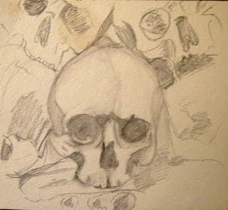
I sketched the skulls with a 2B Koh-I-Noor Gioconda Aquarelle graphite pencil. I have included three skulls, but I am concentrating on the central skull for this tutorial. Be advised that the lighting here is awful today, and it is only getting worse as my drawing progresses, so the photos are abysmal.
 |
The photo is hideous! My lighting is bad today, and
I suspect having a cell phone in the shot may affect color. |
Step 2: First Wash
This is not a very dramatic transformation since I used the light 2B grade, but it establishes a little of the shadows. After letting it dry, I tried to erase a little bit of the graphite in one area, thinking it would go back to the white of the paper- wrong! That only works on smoother papers, I guess, so I do need to use masking fluid. Good thing I found out before adding the darker values!
 |
I have dampened the first sketchy layer. The yellow blotch is a
leftover bit of pastel from the awful study. I brushed it into the paper
with water after erasing it didn't work. |
Step: 3 (which should have been step 2): Mask off Highlight areas
This is especially important for small works because your highlights may be tiny. I have tiny detail brushes, but they don't hold enough water for this technique. They are for painting in details and highlights, not for painting washes around the tiny areas. I use the tip of my brush handle or a toothpick to apply the mask, and I use the Windsor and Newton colorless variety, which I bought ages ago. It lasts forever when kept in a tightly closed bottle, which is more than I can say for cheaper brands.
Also, be cautious about using masking fluid on papers lighter than 140 lb because they are not meant for this technique and may tear when you remove the film later.
 |
I started working in darker values after the masking
fluid (yellow blobs) had dried. |
Step 4: Darken Values
First, I make sure that my first layer of graphite wash and my frisket masked areas have dried completely. This is essential, and even though I am impatient when I am in my artsy mode, I have learned from past failures. The graphite washes dry very quickly, but masking fluid can take a little longer, especially in a humid environment. Of course it has been raining all week!
So I go over the darkest shadow areas with my 6B Gioconda Aquarelle, and then I activate the graphite with water using a Plaid #6 round brush. The process sounds like I am just slapping water over pencil strokes, but I am actually manipulating the washes as I would with watercolor paint to create subtle variance in the values.
You can see the yellowish blobs of masking fluid in the picture for this step, along with a lot of dark specks that look like crumbs. That is where the edge of my pencil rubbed against some masking fluid. All of this will disappear once I remove the masking film.
 |
| This photo encompasses steps 4 and 5 |
Step 5: Remove Masking Film, Refine Values
As you can see by the photo, my "unmasked" areas are rather rough and irregular, which is to be expected since I am working so small. That is no big deal- better to have too much highlight at this stage than not enough. I can use water and graphite to refine the highlighted areas. I added more 6B graphite to some shadows, and I used the HB Prismacolor water soluble graphite pencil for some mid-tones. Yes, HB Prisma is darker than 2B Koh-I-Nor. I also realized that it is just the 2B KIN that does not erase well after it dries. I think it is the binder they use as there would be more binder in the 2B than the 6B.
You may be able to tell that I made a boo-boo on the left eye socket. That was me trying to erase before the paper had dried completely. Learn from me- be patient.
Step 6: Add some InkTense-y Goodness
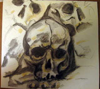
I want a wee bit of color in the final image. It may not be visible in my first picture, but there is a warm lighting in the photo as it appears on my phone, and I like this because it is more natural and moodier than a purely gray-scale image. I had promised an InkTense review, but this is not it. I used the colors Tan, Oak, Sepia Ink, and Charcoal Gray to add touches of color throughout the composition. I have worked more on the background at this point as well, but I am not finished yet. There are several areas that require some refining and I need to add more details.
 |
Yep, I screwed up adding InkTense tones. It is not so much
the color as how the ink interacts with the graphite. |
Honestly, I liked it better at step 5, but I may be able to save it yet. If nothing else, maybe you have learned a lesson from my failures here. As I said, I think I can make it look decent again. Most of my work has "awkward" phases, but sometimes I just don't know when to stop. What do you think? I will report back on this little piece when I write my next post. I may have to give up tonight and wait for better lighting tomorrow!


